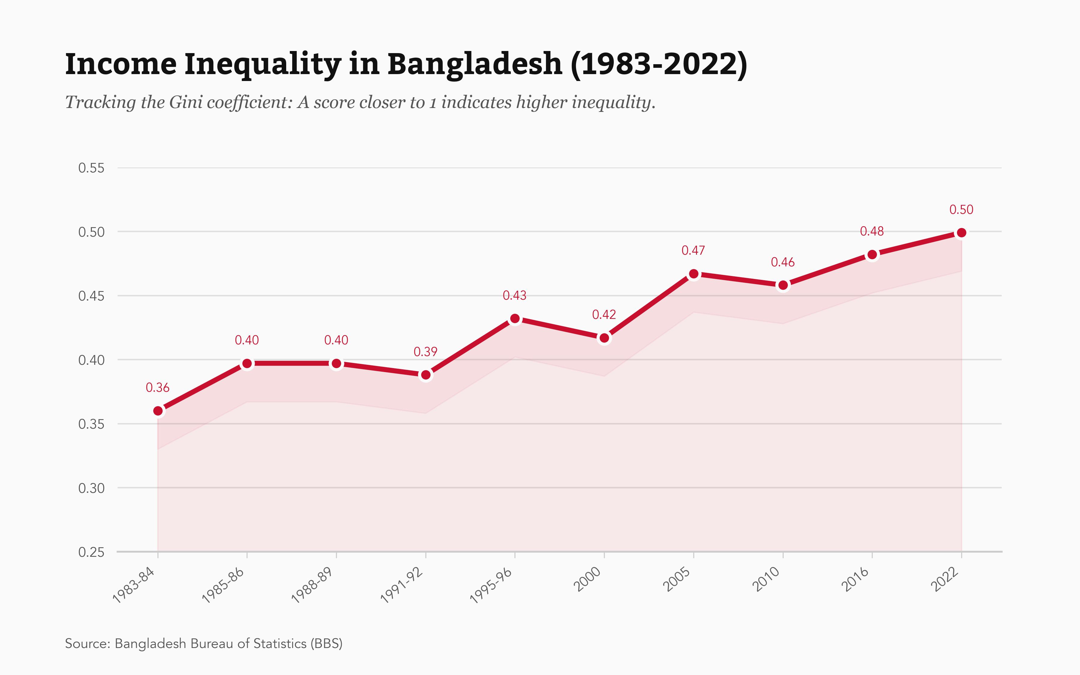
This project focuses on the Gini coefficient, a standard measure of statistical dispersion intended to represent the income or wealth inequality within a nation. A Gini coefficient of 0 represents perfect equality, while a coefficient of 1 implies maximal inequality. The data is taken from the Bangladesh Bureau of Statistics (BBS).
Key Findings
This chart shows a clear and concerning upward trend. The Gini coefficient has risen from 0.36 in 1983–84 to 0.50 in 2022. The higher the Gini, the worse the wealth distribution. Generally, developed countries tend to have lower Gini coefficients, indicating relatively lower income or wealth inequality. For example, countries such as Sweden, Norway, Finland, and Denmark have traditionally shown lower Gini coefficients, typically below 0.30.
Tools Used
This visualization was also created using Python's data science stack: Pandas for data handling, and Matplotlib for plotting. The design focuses on a clean line chart to effectively show the trend over time, with annotations to make the Gini scale understandable to a broader audience.